
UX DESIGN
UX DESIGN
GOOGLE CERTIFICATE UX PROJECT 1

CueRoll is a mobile app designed for moviegoers to easily check showtimes, book tickets, and order snacks. Tailored for casual and frequent cinema lovers, the app offers a smooth, intuitive experience that makes planning a movie night fast and convenient.
Project Overview: March 2025 – May 2025 (3 months)
PROJECT OVERVIEW
!
THE PROBLEM
To create a user-friendly app that streamlines showtime browsing, ticket purchases, and snack orders, while helping the theater reach more customers through a modern digital experience.
*
THE GOAL
To design a modern, easy-to-use app that simplifies ticket booking and snack ordering while helping the theater attract more customers and boost engagement.
• User research • Information architecture • Wireframing • UI design • Prototyping • Usability testing.
My Goal: UX/UI Designer responsible for user research, wireframes, visual design, and prototyping.
UNDERSTANDING THE USER
User research: summary: As part of my user research, I conducted qualitative interviews and observational studies to understand user behaviors, needs, and pain points. Initially, I assumed that users were primarily concerned with basic functionality, but the research revealed deeper frustrations related to navigation and emotional engagement. From these insights, I developed detailed personas to represent different user types, crafted clear problem statements to define the core issues, and created user journey maps to visualize each step of the user experience. These tools helped clarify user motivations and guided design decisions throughout the process.
USER RESEARCH: SUMMARY
1
COMPLICATED NAVIGATION
Users found it confusing to locate showtimes or return to the main screen, often needing multiple taps to complete a simple task.
2
UNCLEAR SNACK ORDERING
The process for ordering snacks was unintuitive, with unclear item descriptions and no visual confirmation before checkout.
3
LIMITED FILTERING OPTIONS
Users had difficulty finding specific movie genres or languages due to the lack of effective filtering and search tools.
4
NO REAL-TIME SEAT AVAILABILITY
Several users were frustrated by the inability to see real-time seat availability, which made the booking process feel uncertain and slow.
USER PERSONA

USER JOURNEY MAP

This user journey map outlines the typical experience of Laura M., a casual moviegoer, as she interacts with the CueRoll app. It highlights her goals, emotions, and pain points across each stage of the journey from initial awareness to post-booking experience
SITEMAP

The sitemap for the CueRoll app is organized using a hierarchical structure to clearly rep- resent the relationships between main sections and their respective subpages. At the top level, the app is divided into key categories such as Showtimes, Tickets, Snacks, Account, and Settings, all branching out from the Home page. Each section expands into more specific functionalities—for example, Tickets leads to My Tickets and Ticket History, while Snacks includes menu items like Popcorn, Drinks, and Combos. This structure provides a logical and user-friendly navigation flow, making it easier to visualize the app’s architec- ture and user journey.
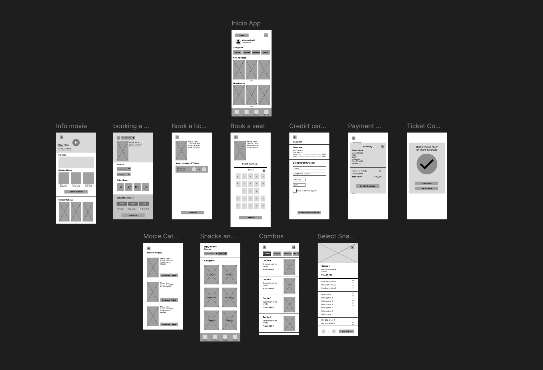
PAPER WIREFRAMES
I began the design process with paper wireframes to quickly explore layout ideas and user flows. This helped me focus on structure and usability, allowing for fast iteration before moving to digital wireframes.


PAPER WIREFRAMES SCREEN SIZE VARIATIONS


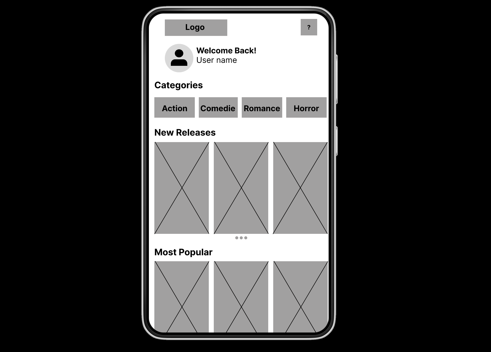
DIGITAL WIREFRAMES
To create the digital wireframes, I built on the paper versions and focused on improving usability. My goal was to make navigation clearer and help users complete key tasks efficiently. Based on peer feedback, I added visual cues to guide users through the app.
I added user icons and arrows to help users understand where they are and how to move between screens. This improves the overall navigation experience.
Buttons were added to support key action like booking tickets or ordering snacks, making it easier for users to complete their goals quickly.

DIGITAL WIREFRAMES SIZE VARIATION
To create the digital wireframes, I built on the paper versions and focused on improving usability. My goal was to make navigation clearer and help users complete key tasks efficiently. Based on peer feedback, I added visual cues to guide users through the app.


I created three size variations of the paper wireframes i phone, samsung and xiomi to ensure the layout adapted well across different screen sizes. This helped me design a consistent and responsive experience from the start.
LOW FIDELITY PROTOTYPE
For this prototype, I created a connected user flow in Figma that guides the user from the home screen to the final purchase confirmation. The goal was to simulate the ticket-buying experience clearly and efficiently. I used arrows to visually represent the steps needed to view showtimes, select seats, and check out.
Based on peer feedback, I refined the placement of action buttons and improved the consistency of layout elements across screens. This helped streamline the process and made the flow more intuitive for users.
Link: https://www.figma.com/proto/NzIMjx2MBdyMVVmGHPrgqZ/Wireframes-app-Movie-Theater?node-id=0-1&t=iCirszt0v18W11Nz-1

USABILITY STUDY: PARAMETERS
1
STUDY TYPE
Unmoderated usability study
2
LOCATION
Ecuador, Quito
3
PARTICIPANTS
5 Participants
4
LENGTH
15-20 min
USABILITY STUDY: FINDINGS
To improve the user experience, the interface should stay clean during movie selection, the cart icon should remain visible with item indicators, and a confirmation step should be added before completing any purchase.
1
FINDING
Keep the interface clean and uncluttered, especially in the section where users select the movie's time, format, and language.
2
FINDING
After selecting a snack or combo, keep the cart icon fixed on the screen while scrolling, and include a visual indicator to show that an item has been added.
3
FINDING
Add an extra security step that prompts users to con- firm their purchase—whether it's a movie ticket or a snack—to ensure accuracy and allow them to go back if they're unsure.
MOCKUPS
My goal was to improve clarity and usability. Peer feedback led me to simplify the movie selection screen, make the cart more visible, and add a confirmation step to avoid mistakes.

BEFORE

AFTER
My goal was to improve clarity and usability. Peer feedback led me to simplify the movie selection screen, make the cart more visible, and add a confirmation step to avoid mistakes.

BEFORE

AFTER
MOCKUPS: ORIGINAL SCREEN SIZE


MOCKUPS: SCREEN SIZE VARIATION


HIGH-FIDELITY PROTOTYPE
For this high-fidelity prototype, I created a connected user flow in Figma that guides the user from the home screen to the final purchase confirmation. The goal was to simulate the ticket-buying experience in a realistic and efficient way.
I used visual cues to show the steps for viewing showtimes, selecting seats, and checking out. Based on peer feedback, I refined the placement of action buttons and ensured layout consistency across screens, making the flow more intuitive and polished.
Link: https://www.figma.com/proto/NzIMjx2MBdyMVVmGHPrgqZ/Wireframes-app-Movie-Theater?node-id=124-2&t=FrlGQTpxHguKubc2-1

USABILITY STUDY FINDINGS
1
COLOR CONTRAST
Ensured sufficient contrast between text and back- ground to support users with visual impairments.
2
TEXT SIZE LEGIBILITY
Used readable fonts and allowed for dynamic text resizing to improve readability for users with low vision.
3
KEYBOARD NAVIGATION
Designed interactive elements to be accessible via keyboard for users who cannot use a mouse or touchscreen.
TAKEAWAYS
1
IMPACT
The improved wireframes made the user flow more intuitive and easy to follow. One peer mentioned, “It feels really smooth—I knew exactly what to do next without getting lost.”
2
WHAT I LEARNED
Through this project, I learned how to apply user research to guide design decisions and create a more user-centered experience. I also improved my ability to build connected prototypes in Figma and respond to peer feedback to refine both usability and layout.
NEXT STEPS
1
The first step would be to create a high-fidelity prototype with final visuals, color schemes, and typography. This would help bring the user experience closer to a real product and allow for more detailed usability testing.
2
Next, I would conduct usability tests with users from different age groups to gather more feedback on the flow, accessibility, and clarity of the inter- face. This would help uncover any areas of confusion and guide further improvements.
3
Finally, I would explore implementing additional features like user profiles, saved favorites, and real-time seat updates. These additions could enhance the user experience and provide more value to frequent moviegoers.