Branding
Branding

PROJECT 1: NEURO INNOVATION
For Neuro Innovation, a forward-thinking neurology clinic, I developed a comprehensive branding solution designed to reflect the clinic’s expertise, professionalism, and innovative spirit in the field of neurological care.
THE ISOTYPE

To design the isotype for NeuroInnovation, I deconstructed key elements of a neuron: the nucleus, the axon terminals, and a set of structured lines. By abstracting these components and combining them visually, I created a symbol that captures the essence of neural connectivity, structure, and flow. The result is a distinctive isotype that reflects the clinic’s focus on neurology and innovation.
COLORS
The color palette for this project was carefully curated to reflect a balance between professionalism, innovation, and approachability. The primary tones include a calming aqua blue (#4FC0D0) and a deep teal blue (#174B60), which together convey trust and depth. These are supported by accent colors such as leaf green (#AED47B), which introduces freshness and vitality, and steel blue (#1A6C94), adding contrast and stability. White (#FFFFFF) is used as a neutral background to ensure clarity and legibility. This combination ensures a clean, modern aesthetic that supports the brand’s neurological and scientific focus while maintaining visual harmony across all applications.

FONTS
For this project, I selected two complementary Google Fonts to establish a clear visual hierarchy. Raleway is used for titles and headings due to its elegant and modern style, making it ideal for grabbing attention. For body text, I chose Poppins, a geometric sans-serif typeface that ensures readability and consistency across all communication materials. Together, these fonts create a clean and professional aesthetic that aligns with the brand’s innovative and contemporary identity.


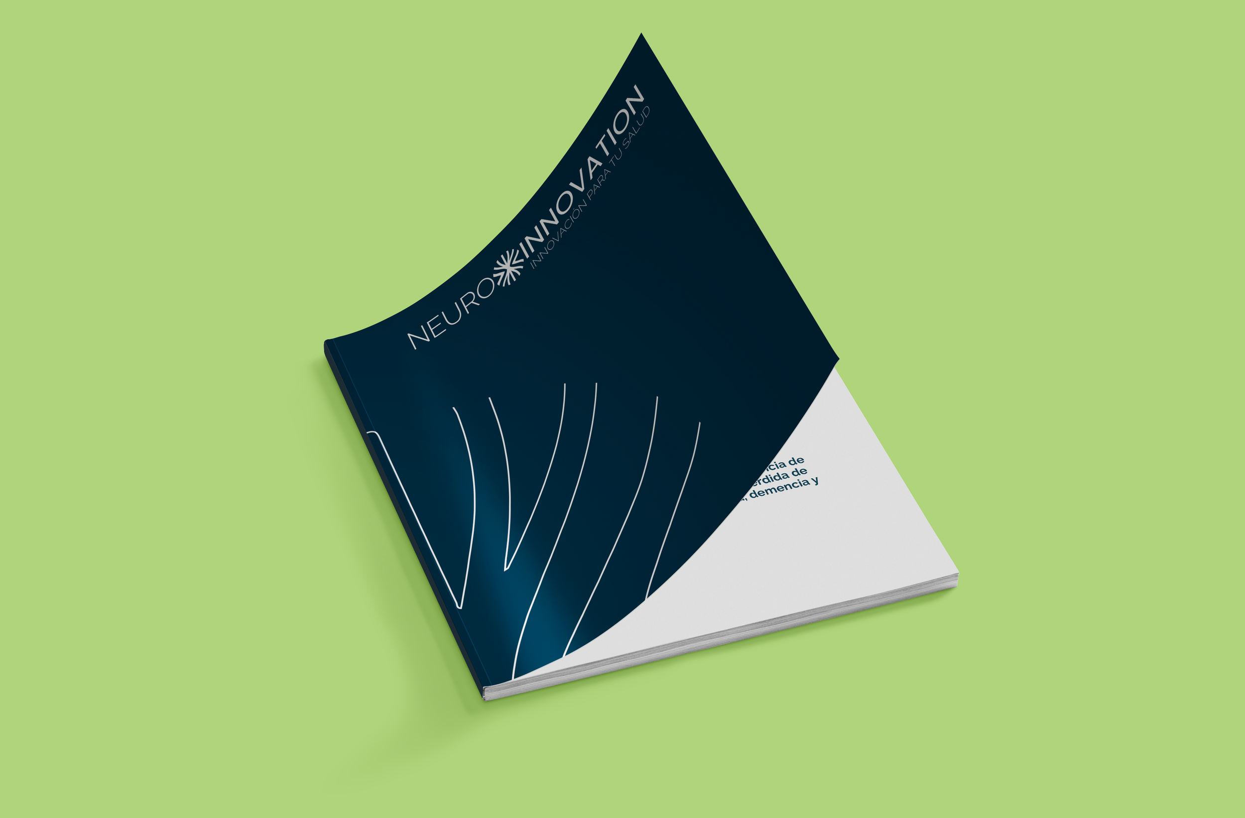
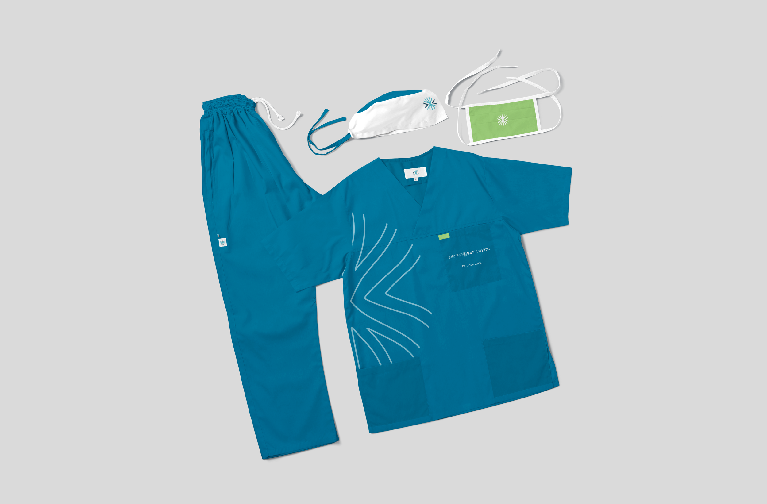
APLICATIONS


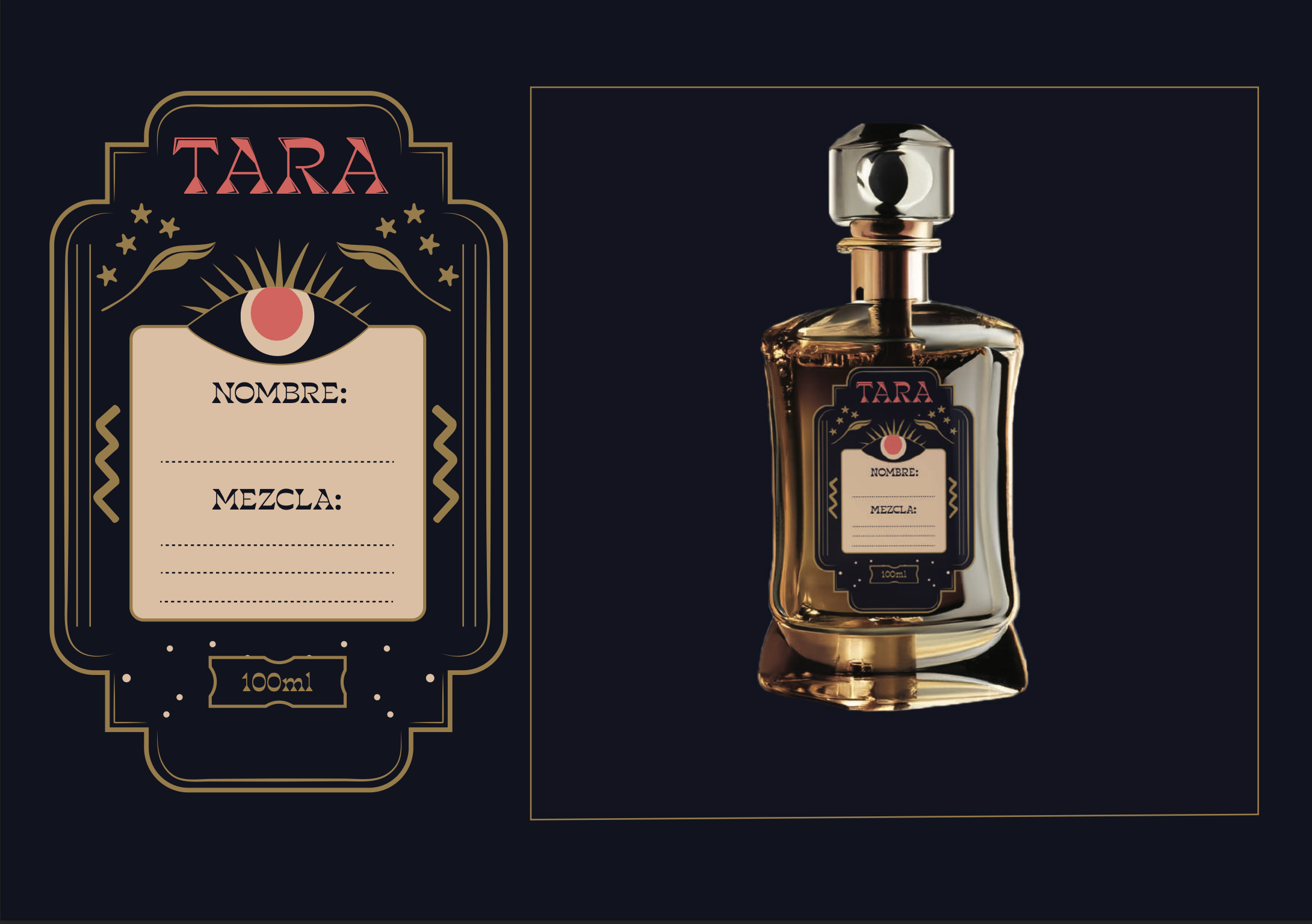
PROJECT 2: TARA
Tara is a brand that underwent a complete strategic management process. This brand's value proposition is to express your essence, as it offers a personalized perfume based on each person's zodiac sign. The brand also has other fragrances dedicated to each zodiac sign and additional services such as an in-store tarot card reading experience.

TYTPOGRAPHY
The typography of TARA plays a key role in defining the brand's identity, blending mysticism with elegance. The primary typeface, Blackest Bold, features sharp geometric shapes and dramatic contrasts that echo the visual language of tarot and astrology. Its sculptural, triangular forms convey strength, sophistication, and a touch of the esoteric—perfectly suited for a brand centered on zodiac personalization. Complementing this is Faustina, a serif typeface used for supporting text. Faustina brings warmth, readability, and classical balance to the composition, creating a refined contrast that enhances both the visual hierarchy and the brand's mystical elegance.

THE COLORS
TARA’s color palette blends mystery, elegance, and warmth to reflect the brand’s astrological and sensorial essence. The deep navy (Pantone 7547 C) evokes the cosmos and intuition, serving as a grounding, mystical base. The vibrant coral red (Pantone 178 C) adds emotional energy and passion, while the soft beige (Pantone 7415 C) brings warmth and a sense of refined comfort. Finally, the muted gold (Pantone 7558 C) adds a touch of sophistication and earthy luxury, completing a palette that feels both celestial and grounded—perfectly capturing TARA’s identity.

THE BRAND
The logo, with its geometric and angular typography, evokes a sense of symmetry, ritual, and spiritual alignment—mirroring the brand’s core concept of personalized zodiac-based perfumes. The sharp serifs and triangular motifs suggest elemental balance and cosmic energy, reinforcing TARA’s promise to help individuals express their essence.

THE ESSENCE
TARA’s fragrance collection is thoughtfully curated around the four zodiac elements, each with scents that reflect the core essence of the signs they represent. Fire signs (Aries, Leo, Sagittarius) are energized by bold and warm notes like mint, amber, and sandalwood. Water signs (Pisces, Scorpio, Cancer) are captured through soft, emotional aromas such as lily, black amber, and rose. Earth signs (Taurus, Virgo, Capricorn) are grounded in comforting and natural scents like vanilla, eucalyptus, and cedarwood. Air signs (Gemini, Aquarius, Libra) are expressed through fresh, ethereal notes of lemon, incense, and lily—creating a sensory experience aligned with each sign’s unique personality.


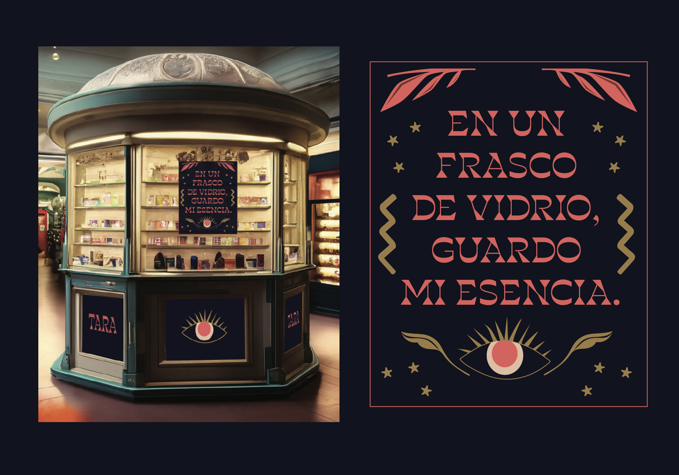
APPLICATIONS